Python包,可轻松从多索引数据框中制作柱状图。

项目描述
Barplots


Python包,可轻松从多索引数据框中制作柱状图。
我该如何安装这个包?
像往常一样,只需使用pip下载即可
pip install barplots
文档
大多数方法,特别是那些提供给用户使用的方法,都提供了文档字符串。请考虑阅读这些文档字符串,了解库的最新更新。
DataFrame结构示例
提供给barplots库的数据框可能看起来如下
| miss_rate | fall_out | mcc | evaluation_type | unbalance | graph_name | normalization_name |
|---|---|---|---|---|---|---|
| 0.0332031 | 0.705078 | 0.353357 | train | 10 | AlligatorSinensis | Traditional |
| 0.240234 | 0.478516 | 0.289591 | train | 1 | CanisLupus | Right Laplacian |
| 0.0253906 | 0.931641 | 0.101643 | train | 100 | AlligatorSinensis | Right Laplacian |
| 0.121094 | 0.699219 | 0.220219 | train | 10 | HomoSapiens | Traditional |
| 0.0136719 | 0.292969 | 0.722095 | test | 1 | CanisLupus | Right Laplacian |
| 0.0605469 | 0.90625 | 0.0622185 | test | 10 | AmanitaMuscariaKoideBx008 | Traditional |
| 0.0078125 | 0.4375 | 0.614287 | train | 100 | AmanitaMuscariaKoideBx008 | Traditional |
| 0.171875 | 0.869141 | -0.0572194 | train | 100 | AlligatorSinensis | Traditional |
| 0.0859375 | 0.810547 | 0.150206 | train | 10 | MusMusculus | Right Laplacian |
| 0.0273438 | 0.646484 | 0.415357 | test | 10 | MusMusculus | Right Laplacian |
具体来说,在这个例子中,我们可能通过按evaluation_type、unbalance、graph_name和normalization_name列分组,为Miss rate、fallout和Matthew Correlation Coefficient这些特征创建柱状图。
一个示例CSV文件可以在这里查看:这里。
使用示例
以下是一些常见用法的示例。基本上,每个图表都显示相同的数据或基于提供的分组索引的均值。根据您数据的可视化效果选择最佳表示方式,因为对于每个数据集,一种表示不一定比另一种更好。
注意:以下示例中使用的数据是用于测试目的的随机生成的。请不要将这些值视为使用相同标签(细胞系等)的实验的有效结果,这些标签仅用于展示可能的用法。
对于每个示例,所考虑的数据框df的加载方式如下
import pandas as pd

df = pd.read_csv("tests/test_case.csv")
此外,对于每个示例,用于清洗特定于数据集标签的custom_defaults
custom_defaults = {
    "P": "promoters",
    "E": "enhancers",
    "A": "active ",
    "I": "inactive ",
    "+": " and ",
    "": "anything",
    "Validation": "val"
}
水平示例A
在以下示例中,我们将水平绘制条形图,将组标签旋转90度,并将条形标签显示为共享图例。
from barplots import barplots
import pandas as pd

df = pd.read_csv("tests/test_case.csv")
custom_defaults = {
    "P": "promoters",
    "E": "enhancers",
    "A": "active ",
    "I": "inactive ",
    "+": " and ",
    "": "anything",
    "Validation": "val"
}

barplots(
    df,
    groupby=["task", "model"],
    orientation="horizontal",
    show_legend=True,
    minor_rotation=90,
    custom_defaults=custom_defaults
)
结果可在此处查看 此处。
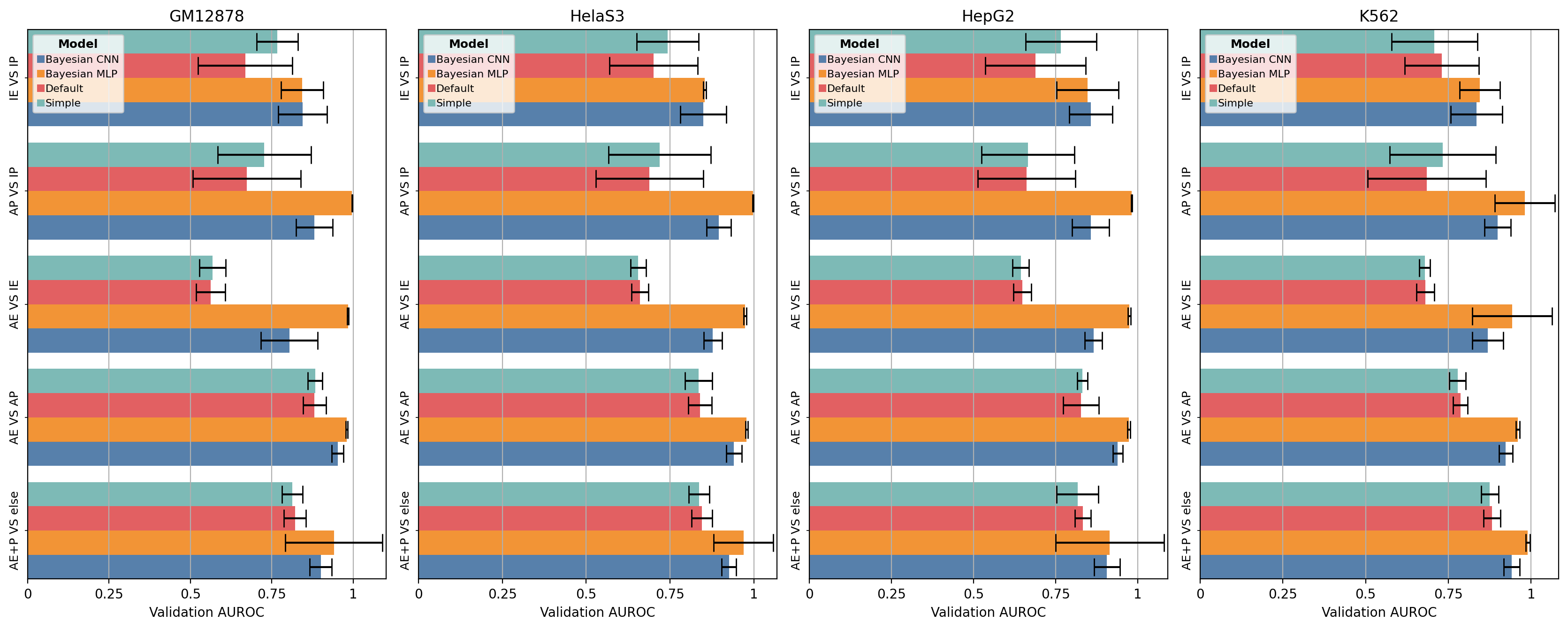
水平示例B
在这个示例中,我们将使用水平条形图绘制顶部索引作为多个子图,将组标签旋转90度,并将条形标签显示为共享图例。
from barplots import barplots
import pandas as pd

df = pd.read_csv("tests/test_case.csv")
custom_defaults = {
    "P": "promoters",
    "E": "enhancers",
    "A": "active ",
    "I": "inactive ",
    "+": " and ",
    "": "anything",
    "Validation": "val"
}

barplots(
    df,
    groupby=["cell_line", "task", "model"],
    orientation="horizontal",
    show_legend=True,
    subplots=True,
    minor_rotation=90,
    custom_defaults=custom_defaults
)
水平示例C
在这个示例中,我们将绘制水平条形图,将顶部组标签旋转90度,并将条形标签显示为次要刻度。
from barplots import barplots
import pandas as pd

df = pd.read_csv("tests/test_case.csv")
custom_defaults = {
    "P": "promoters",
    "E": "enhancers",
    "A": "active ",
    "I": "inactive ",
    "+": " and ",
    "": "anything",
    "Validation": "val"
}

barplots(
    df,
    groupby=["task", "model"],
    orientation="horizontal",
    show_legend=False,
    major_rotation=90,
    custom_defaults=custom_defaults
)
结果可在此处查看 此处。
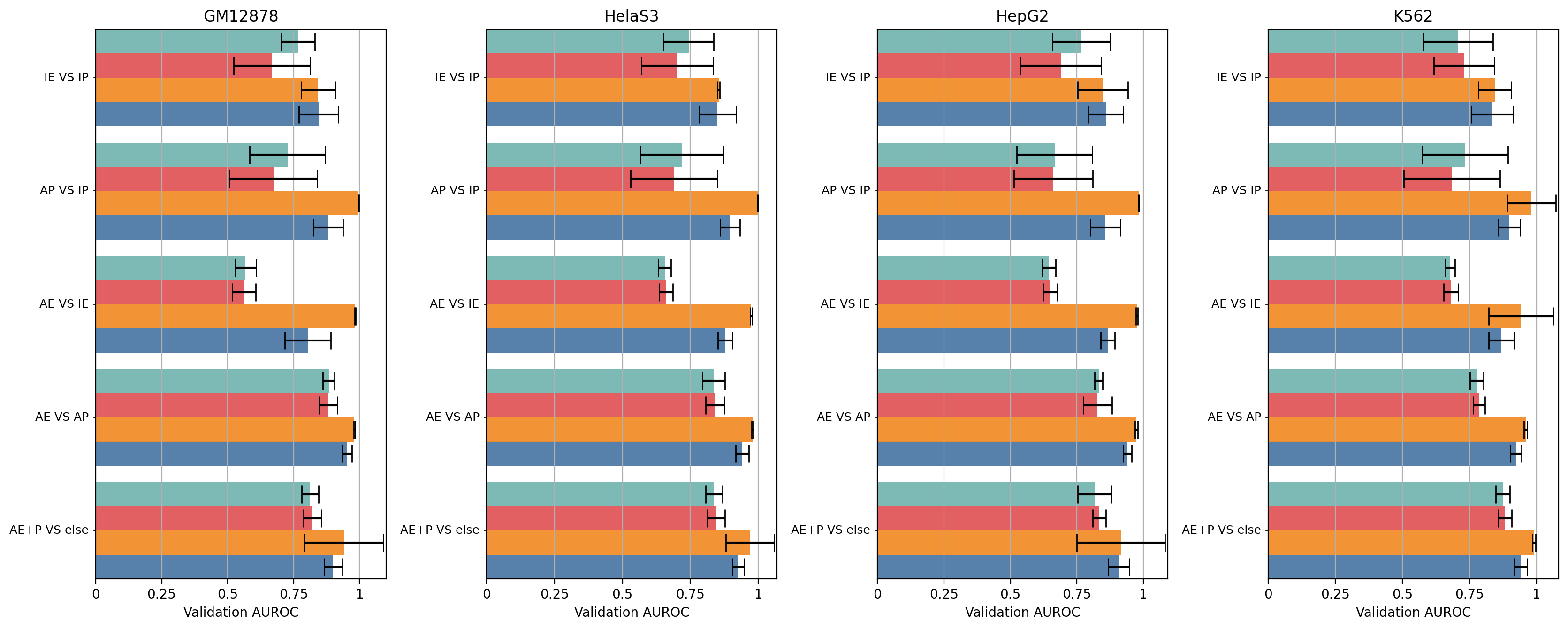
水平示例D
在这个示例中,我们将使用水平条形图绘制顶部索引作为多个子图,将组标签旋转90度,并将条形标签显示为次要刻度。
from barplots import barplots
import pandas as pd

df = pd.read_csv("tests/test_case.csv")
custom_defaults = {
    "P": "promoters",
    "E": "enhancers",
    "A": "active ",
    "I": "inactive ",
    "+": " and ",
    "": "anything",
    "Validation": "val"
}

barplots(
    df,
    groupby=["cell_line", "task", "model"],
    orientation="horizontal",
    show_legend=False,
    major_rotation=90,
    subplots=True,
    custom_defaults=custom_defaults
)
垂直示例A
在这个示例中,我们将垂直绘制条形图,并将条形标签显示为共享图例。
from barplots import barplots
import pandas as pd

df = pd.read_csv("tests/test_case.csv")
custom_defaults = {
    "P": "promoters",
    "E": "enhancers",
    "A": "active ",
    "I": "inactive ",
    "+": " and ",
    "": "anything",
    "Validation": "val"
}

barplots(
    df,
    groupby=["task", "model"],
    orientation="vertical",
    show_legend=True,
    custom_defaults=custom_defaults
)
结果可在此处查看 此处。
垂直示例B
在这个示例中,我们将使用垂直条形图绘制顶部索引作为多个子图,并将条形标签显示为共享图例。
from barplots import barplots
import pandas as pd

df = pd.read_csv("tests/test_case.csv")
custom_defaults = {
    "P": "promoters",
    "E": "enhancers",
    "A": "active ",
    "I": "inactive ",
    "+": " and ",
    "": "anything",
    "Validation": "val"
}

barplots(
    df,
    groupby=["cell_line", "task", "model"],
    orientation="vertical",
    show_legend=True,
    subplots=True,
    custom_defaults=custom_defaults
)

垂直示例C
在这个示例中,我们将绘制垂直条形图,将次要组标签旋转90度,并将条形标签显示为次要刻度。
from barplots import barplots
import pandas as pd

df = pd.read_csv("tests/test_case.csv")
custom_defaults = {
    "P": "promoters",
    "E": "enhancers",
    "A": "active ",
    "I": "inactive ",
    "+": " and ",
    "": "anything",
    "Validation": "val"
}

barplots(
    df,
    groupby=["task", "model"],
    orientation="vertical",
    show_legend=False,
    minor_rotation=90,
    custom_defaults=custom_defaults
)
结果可在此处查看 此处。
垂直示例D
在这个示例中,我们将使用垂直条形图绘制顶部索引作为多个子图,将次要组标签旋转90度,并将条形标签显示为次要刻度。
from barplots import barplots
import pandas as pd

df = pd.read_csv("tests/test_case.csv")
custom_defaults = {
    "P": "promoters",
    "E": "enhancers",
    "A": "active ",
    "I": "inactive ",
    "+": " and ",
    "": "anything",
    "Validation": "val"
}

barplots(
    df,
    groupby=["cell_line", "task", "model"],
    orientation="vertical",
    show_legend=False,
    minor_rotation=90,
    subplots=True,
    custom_defaults=custom_defaults
)


barplots-1.2.0.tar.gz的哈希值
| 算法 | 哈希摘要 | |
|---|---|---|
| SHA256 | 2aedaaf74900e30f7cc227b7bdca0cca87e8cc27332e7fa686b41b34ea194d40 |
|
| MD5 | a378b68c57c53b7bc5805ee400a03cc9 |
|
| BLAKE2b-256 | 18431ecfaaf4b829b34b3c3cccda8fa892b09de422e08d23c1cb77ccae780632 |


